Uploaded with
ImageShack.us
I was talking his actual site, not the forum.
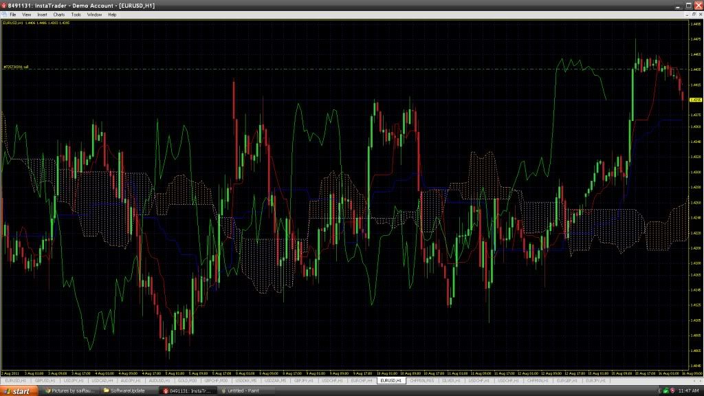
I added my chart, because it is easier for me, now that I know you got the hourly up for the EUR/USD.
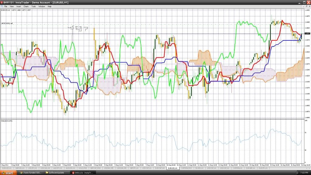
First, we know by looking at the 4-hour and daily this market is in an uptrend. The correction took place because of what we see on the hourly. Now, the cloud has risen to meet up with price action, and then scared the candle back in the UP.
I had a short that I closed about an hour ago on the EUR/CHF. It's price action looks similar to the EUR/USD. Even though I had a nice gain on my trade, it had this same look. Price went shooting UP, then almost went east in the correction. What we are weighting out here is price action in lieu of the cloud, and with what is says on other TF's.
Take a look at your daily chart. What it is showing is if price closes the day at current price, it will get squeezed out of the top of the cloud. Getting squeezed is not the same as the candle just taking the top out, but it is still a bullish indication.
Also, the current struggle price action is having is indicative of what is going on with the 15-min chart, so take a look at it. The price has been under the cloud for quite a few candles, so the bottom of the cloud becomes fresh R. What I am saying is all TF's tell a story. This is why we do not use on TF to determine an entry into the market.
Go to the weekly and monthly and you will see the candles are resting safely on top of the clouds, but not ranging too far from it. The monthly is even showing how price went sideways since popping out of the cloud. That also is a very bullish indication.
As I was writing this, the 15-min candle pushed its way through the bottom of the cloud, then found its way to the top, where it is currently struggling.


 because it truly measures the market! i know i know i should not take your words for it but still it it better to set to 3?